How Effective is a Well-Design Office Space
When a business is considering renovating their office, there is typically a series of contributing factors as to why they are looking for change. These factors can come from a variety of places. Their current space may be dark and closed off and they are seeking a more bright and vibrant space with more access to natural light. Maybe there is a lack of collaborative or hybrid workspaces within their office, and they need more space for their team to work together, or maybe the opposite, the client requires more quiet spaces for their staff to have meetings and have heads down focus workspaces.
Our goal as designers is to problem solve with our clients to ensure your objectives are met. We are a part of your process of growth and shifting to new ways of working or updating old ways of working to help guide and generate what the future holds for your new space. This process includes working alongside our clients, helping to develop spaces that promote employee satisfaction, efficient work settings, comfortable space for staff, and creating a unique look or feel catered to your individual culture and people. Throughout this blog we will look at 2 examples of previous client’s office spaces, pre and post design, and discuss how their goals were met.
Munich Re
SGH Design Partners was retained to design a fresh solution for the 36,000 square foot office at the Munich Re, Toronto Office. Philipp Wassenberg, the former Chairman of Munich Re sat down with SGH to discuss the renovation process, objectives, and success of the project. During our interview, Philipp discussed how the old space was closed off by cubicles and filling cabinets. It was a space that focused on individual privacy over everything else. To ensure a seamless process, carefully selected ambassadors from each team were a part of in-depth visioning sessions throughout the project. This unique connection between client and our Design Team provided for clear understanding of each team’s objectives and needs.
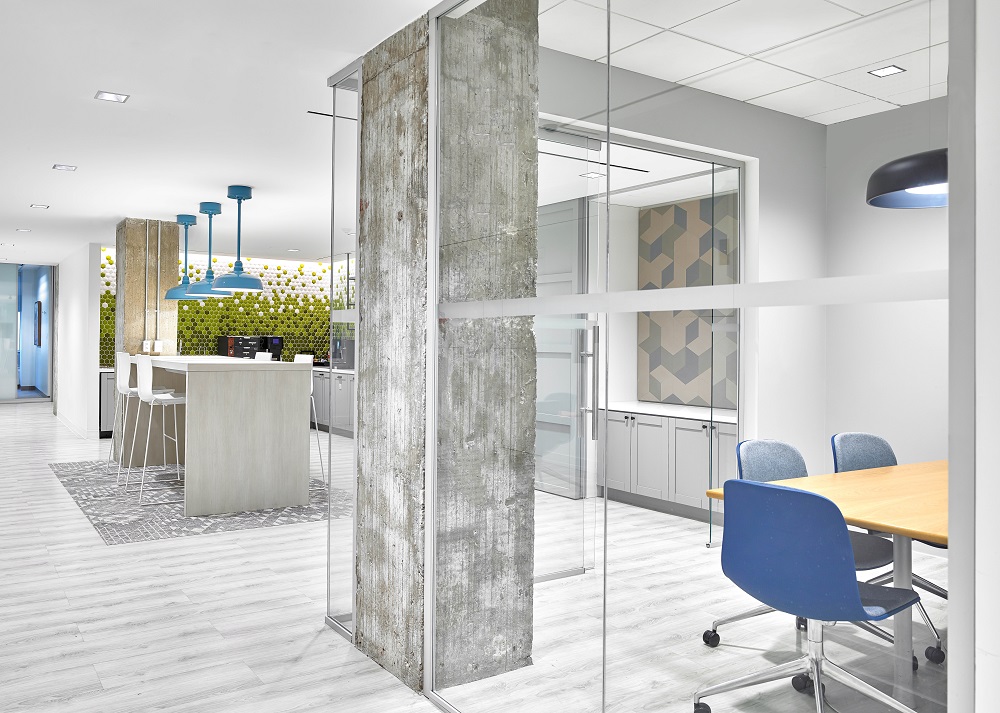
Philipp had a goal of an open concept space that would incorporate a “living room feeling” while keeping a modern design. Access to natural sun light was an important feature, which paired well with the light color selection and lots of Scandinavian design influence. The offices that required privacy had floor to ceiling glass walls which kept the private spaces connected with the rest of the team.
Workstations were selected to cater to flexibility, with an open concept, yet had enough structure that allowed employees to pin up pictures or place personal items on their desk to make them feel more at home. A true transformation from closed office to a welcoming and dynamic space that set the standard for future work with the firm.
When asked about what the space has achieved, Philipp stated that their new space has achieved a far higher level of collaboration, transparency, with people moving around throughout the space and interacting with one another. The space is flexible, which has led to staff becoming more innovative and creative, having a lot more fun in the space than previously. Employees are encouraged to explore the three floors. Unique spaces on each floor include: 21st floor, a multi-purpose training space; 22nd floor, boardroom complex; and 23rd floor, Games/Social lounge. All spaces were designed with the ambassador’s input and inspiration.
By aligning the workplace more closely to the Global brand we achieved strategic objectives for innovation and talent attraction. Previously, the office was set up as individual workspaces and segregated departments which forced people to work independently. The new space encourages sharing of knowledge and information between teams. Work areas visually connect employees and are well balanced with a variety of collaboration and social zones.
Wildeboer Dellelce LLP
Wildeboer Dellelce LLP is one of Canada’s leading standalone corporate finance law firms. This 23,000 square foot office space over three full floors underwent extensive renovations that modernized the office into a playful yet sophisticated space.
SGH started off working as a consultant for Wildeboer Dellelce LLP, helping decide which real estate would best suit their needs. Working as a trusted advisor for the Client during the real estate review process is how it was determined that the decision would be made to stay in their current office space and renovate.
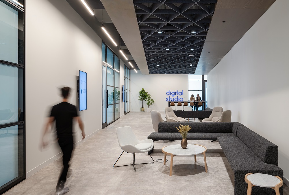
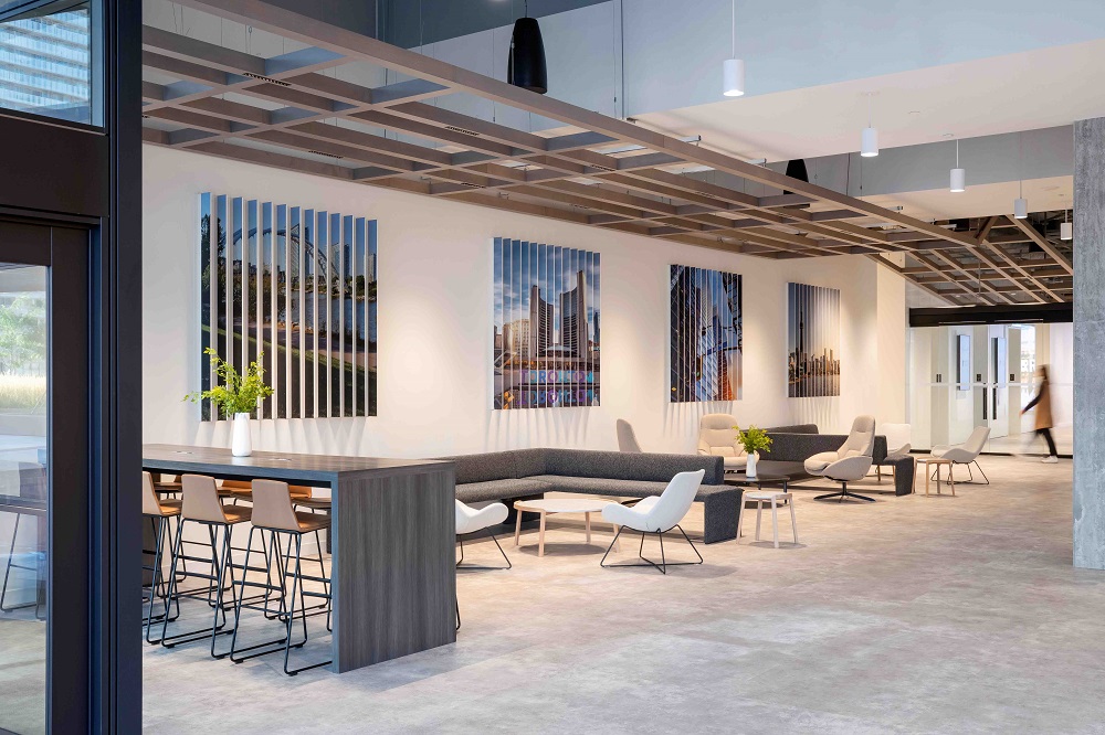
The full three floors overwent extensive renovations that modernized the office into a playful yet sophisticated space. The 8th floor is client-facing, dedicated to meetings and events, and designed to make a lasting impression. When arriving on the reception floor, guests are greeted by a bright open space filled with light and texture that has been created by the sharp angles of the reception desk which contrast the soft colour palette.
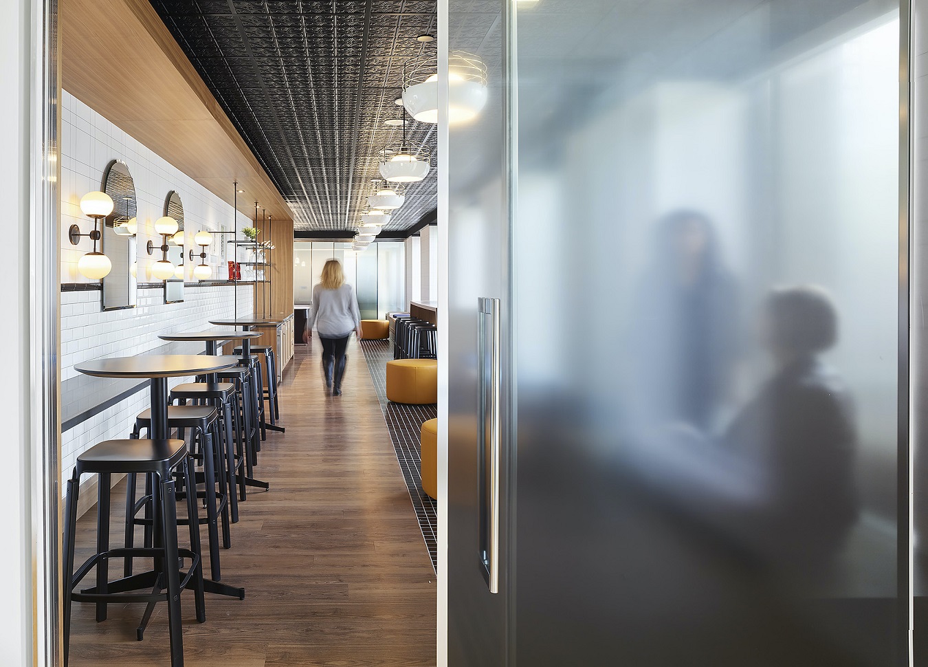
Dark finishes and little collaborative space that represents a typical law firm was transformed into a modern layout with a colourful palette. Designed for efficiency, each of the three floors serve multiple purposes while creating seamless traffic flow and connections between lawyers and clients. A variety of furniture solutions were planned for each floor to encourage employees to move to different working environments throughout their day.
A bright, functionally efficient office that would resonate with their client base and employees while maintaining a strong design identity was imminent. The new design would meet all functional requirements and maintain a ‘wow factor’ all while staying on budget. This space needed to support a seamless connection between lawyers and clients across the three floors of their space. This law office is transformed into a bright open space filled with light and texture consistent with a radiant and transparent look and feel.
After completing the project SGH interviewed Kevin Dane, COO from Wildeboer, to discuss his opinion on the renovation. Kevin Dane, COO from Wildeboer, spoke about the importance of a well-designed office space, through the benefits he saw at his new space. Kevin stated the new office space is more efficient, collaborative, lively, and employee friendly.
At SGH we believe the office is more than a box we assimilate to complete a day’s work, it is somewhere that ideas are created, people interact, business is conducted, and where we live for many hours a week. Quite often clients will come to SGH, knowing they want to renovate their space, but don’t know where to start, our job as designers is to understand how your business works, the in’s and out’s and help solution and guide our clients to determine what strategy we can take to reach your goals. We do not take a one size fits all approach but customize the design process to align with your individual needs and desires for your new space.


