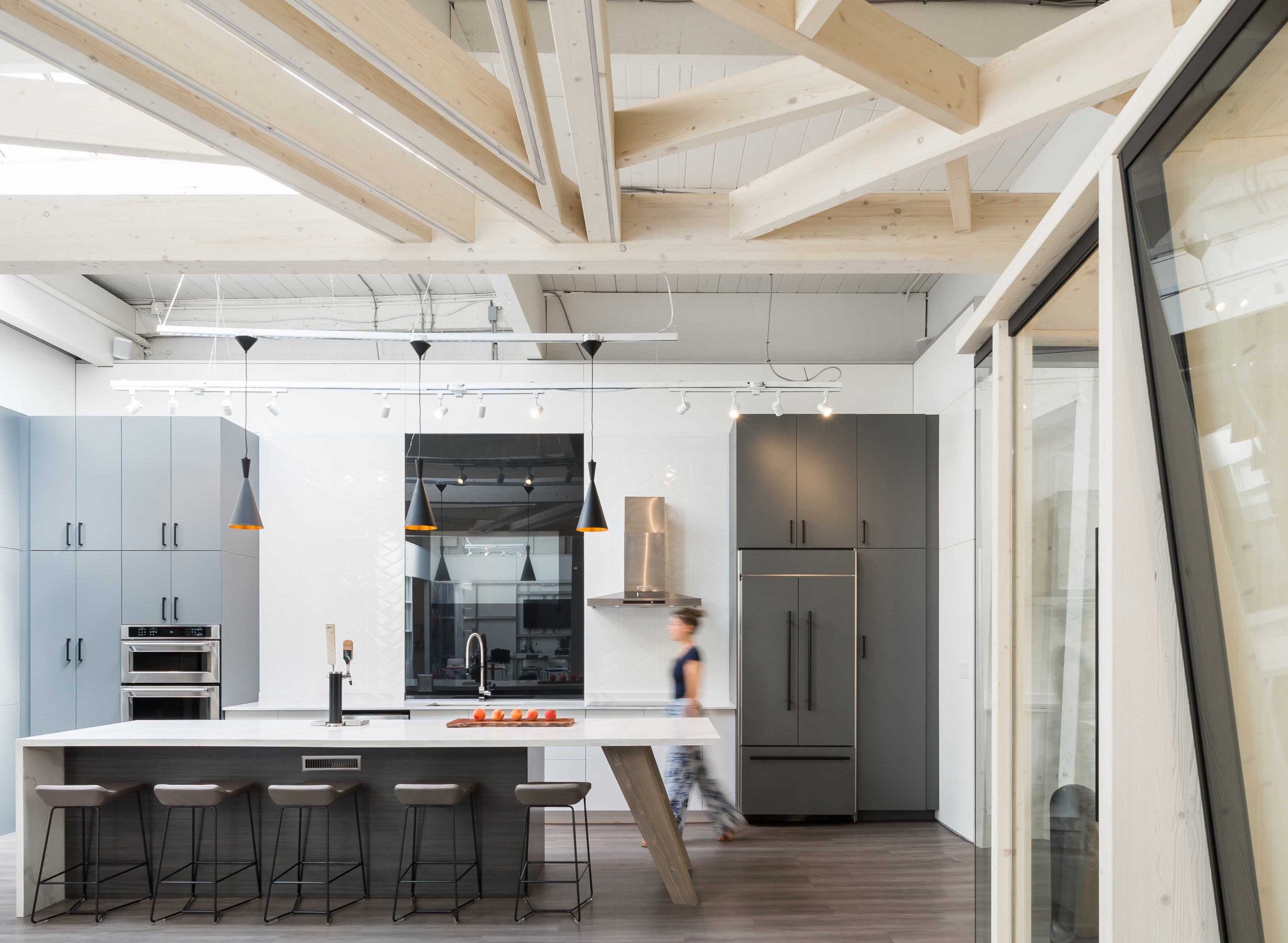
Story Time, Behind the Scenes of Designing Innovior Construction
The goal for Innovior Construction was to find a location with space that would celebrate their capabilities as a construction company focusing on providing sustainable, customizable manufactured interiors. Acting as both a showroom and factory workshop the space needed to demonstrate good design without limitations and debunk myths around prefabrication.
With space hard to come by in Vancouver they were excited to find a1950’s timber-built location in an up-and-coming neighbourhood complete with 12’ high ceilings and skylights that provided the volume and natural light needed to build out vertical displays to showcase their solutions. SGH’s focus was to work directly with the construction savvy client on transforming this uninspired quirky space into a working office, factory and marketing facility that clearly demonstrates the flexibility and design excellence in an energized, urban and vibrant space.
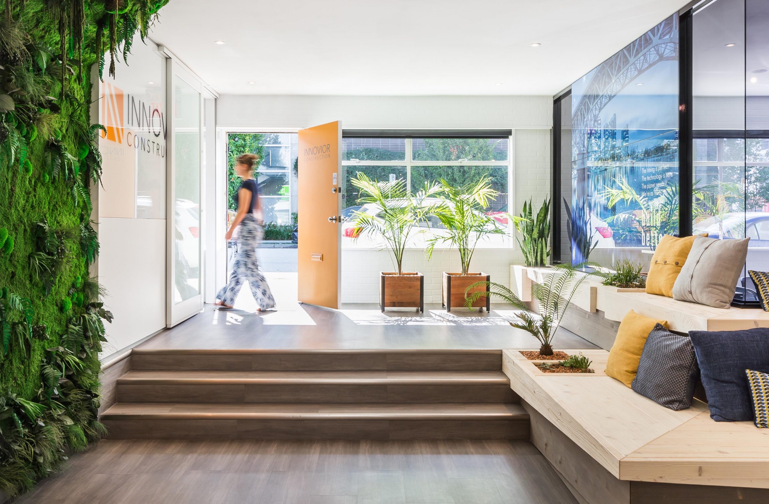
Innovior worked with SGH in the front-end discovery phase to share processes and knowledge of their methods to ensure a clear understanding of their goals and vision. The client wanted the space to reflect their own personal brand and commitment to design excellence. Summery colours, unexpected angles, smooth raw surfaces, fun pattern and texture all work to support an energized, professional, urban and innovative style.
The space could not be just beautiful, it had to be highly functional with working vertical displays, integrated technology, a virtual reality area and a series of vignettes highlighting healthcare, workplace and home environment scenarios. All of these have been incorporated in a unified and minimal way that feels straightforward, approachable and easily achieved. It was also important to display their commitment to sustainability and infuse a sense of health and wellbeing. This has been done using raw materials, a green wall, plants, large glass walls and open spaces allowing lots of natural light in.
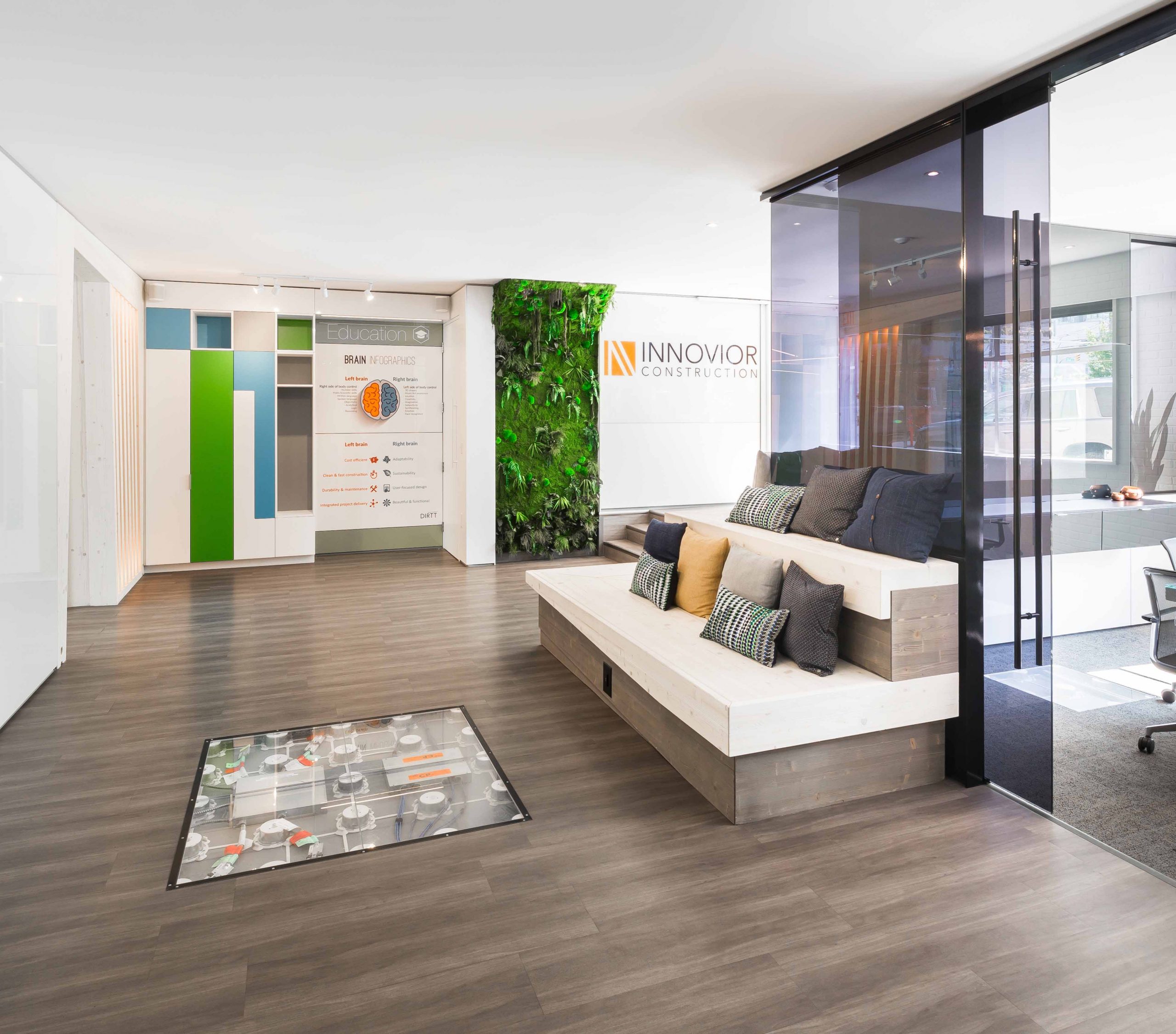
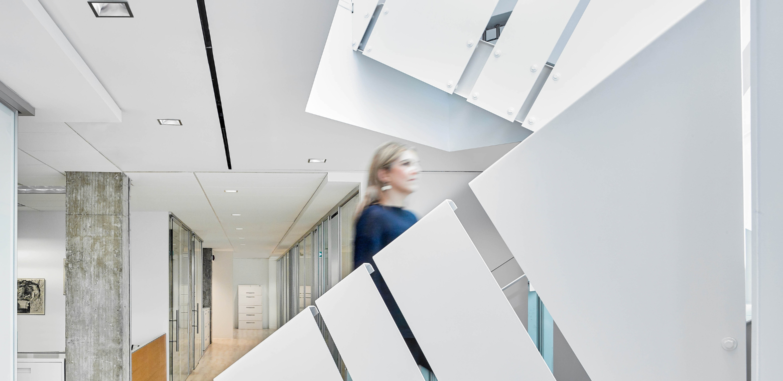
The architectural envelope is clean, modern and neutral with a palette of materials, colour, and pattern unify. Bright white walls and angular timber frames are refined and minimal. Each space creates a new user experience, connected but are similar and cohesive. The construction of walls, doors, frames, millwork and features all work to demonstrate how effective off-site manufactured products can work together. Showcasing their raised floor system in reception, the inner workings of the raised floor are exposed in a defined rectangular space where you would typically expect a coffee table to sit. The mix of laminates and wood surfaces on walls show how their standard materials can be used. The space is also infused with an eclectic, youthful style giving it a casual and relaxed and homelike feel. Raw wood, crisp white walls, delicious fresh colours and lighting all play a part an integral role in building the story and culture. Accessories and artwork have been selected to really finish the space right through to the last detail.
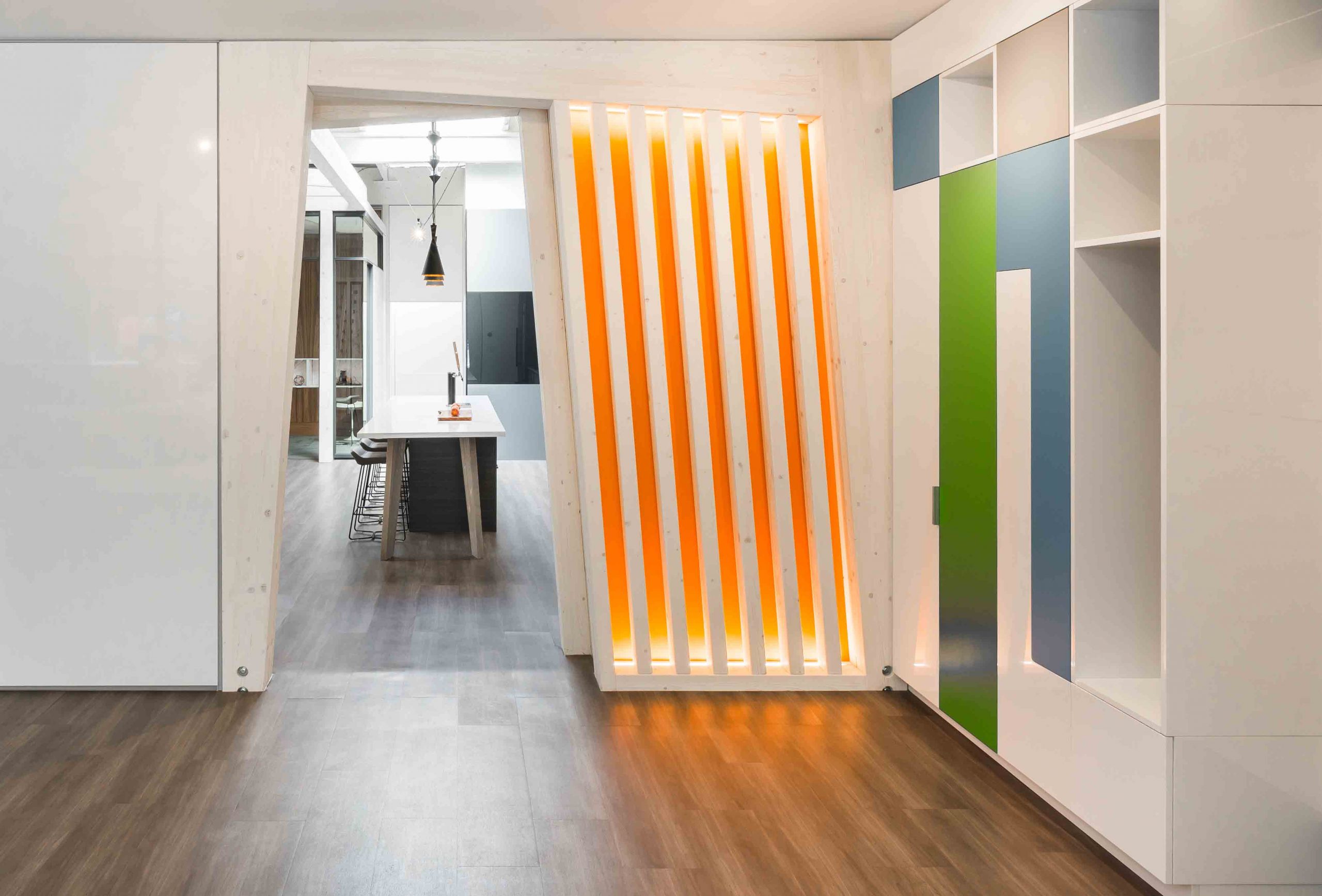
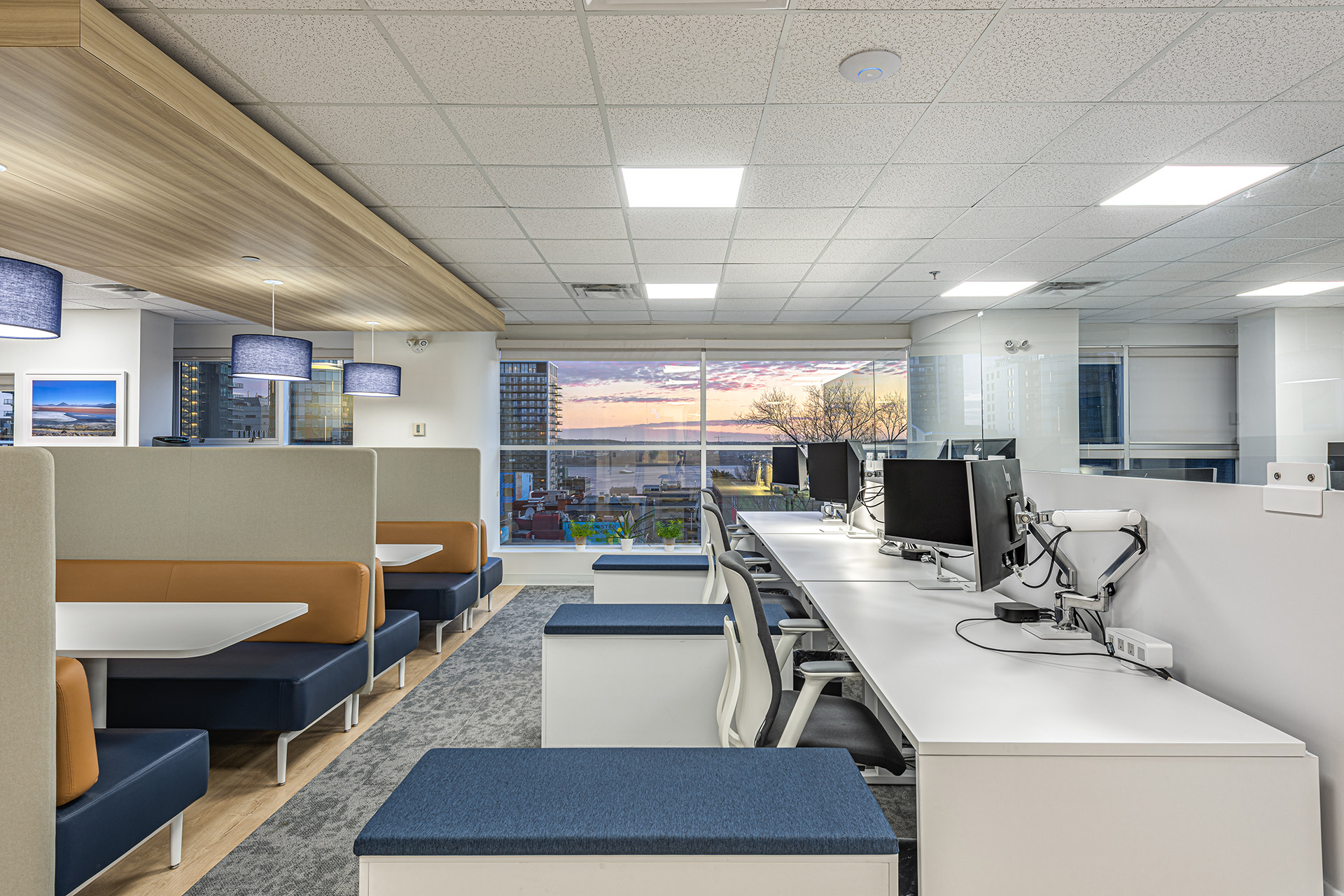
The design approach is understated, timeless and classic. The overall needs to appeal to a culture that is approachable, warm, inviting and interactive. SGH wanted to embrace the quirky nature of the 1950s building yet transform it into a modern, fun, studio like space. It celebrates all that is great about this building, natural light, exposed wood ceilings, a good solid structure and unique changes in heights and depths that create subtle transitions and sightlines.
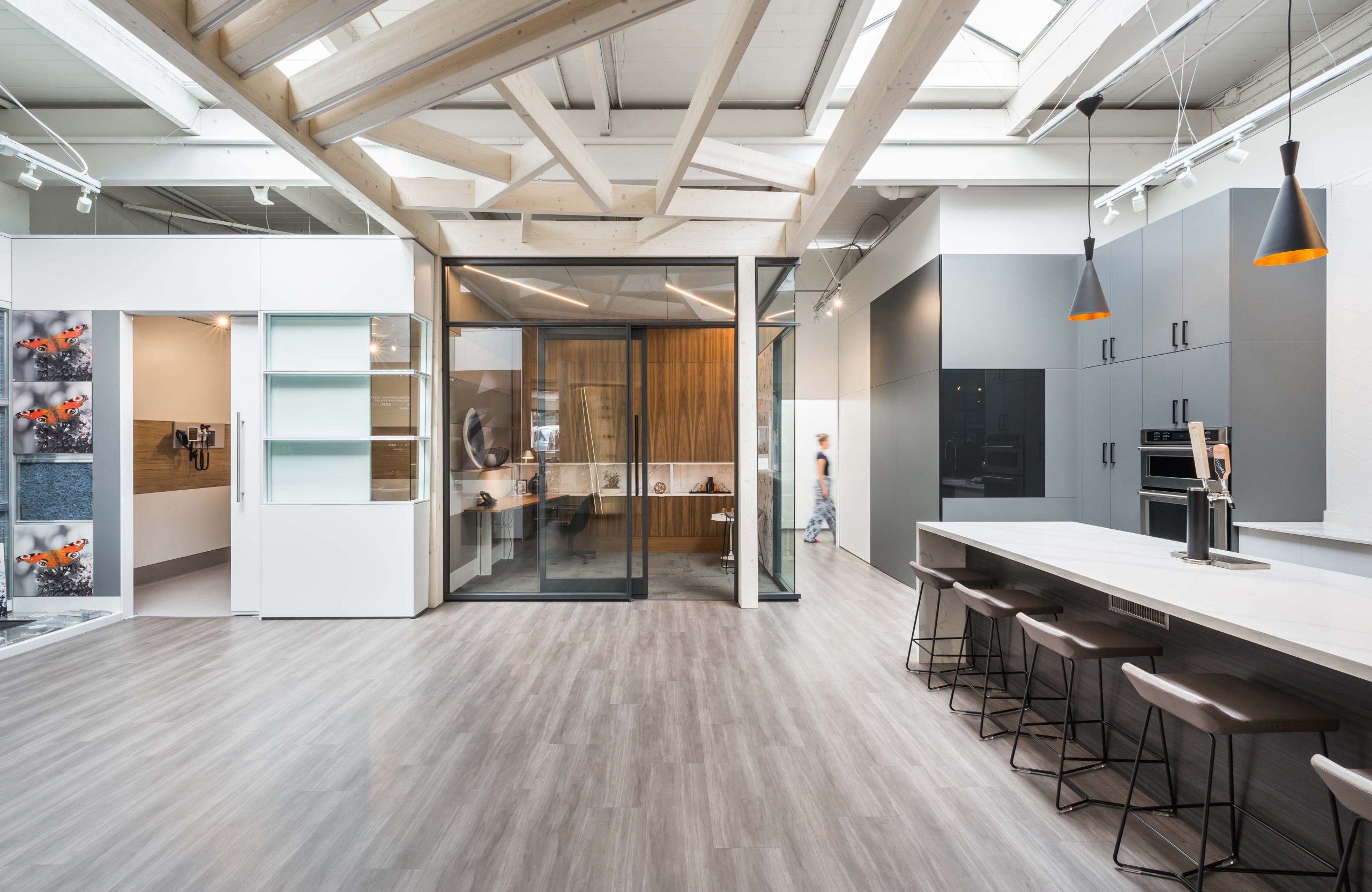
Culture was a big driver, so the design solution needs to foster a sense of community through a mix of warm materials, pattern, casual furniture, interesting light fixtures and summery accent colours. The space needs to seamlessly demonstrate their capabilities and function as an office, showroom and workspace. The space is really relaxing so that customers do not feel overwhelmed by choice but rather inspired by potential and creativity. The integration of technology is subtle and does not overpower the spaces, it is a seamless part of the experience. The benefit of this design is the well-integrated mix of all the activities required to make their business successful and how the design solution maximized this potential. It includes office and workspace in proximity yet buffered from the busy showroom and workshops space. The space itself has been used to demonstrate the diversity of what their construction company can do for their clients, it supports leading edge technology that sets this company apart and it provides a fun, happy space where they can celebrate and meet to truly create amazing solutions for client, in partnership with architects and designers.
Client Statement
After 23 years in prefabricated construction this was my first opportunity to do something from scratch and purpose build for what we needed. It needed to serve the culture and people of our company. Areas to work, areas to educate, cultivate and socialize. It had to do these things in a similar way with the community that we work with and serve. It has become an epicenter for discovery for what could be and our message of Build better. It continues to foster collaboration and true sharing of ideas and all that come together continue to compliment us on this achievement. We are so proud of what we’ve accomplished, and we can’t wait to do it all over again.
