Story Time, Behind the Scenes of Designing Finastra
This dynamic downtown Toronto location is the central and main client focused location for Canada. The project had an aggressive timeline to design and build a creative, highly collaborative, brand focused solution to support the clients marketing strategy globally. Being that the direct contacts and decision makers were not physically seated in Toronto (mostly in the US or Beijing) presented a logistics challenge. SGH devised a strong and detailed management approach on deliverables and a communications methodology was developed.
As Prime Consultant SGH brought together an experienced team including construction manager and engineering consultants. SGH became a trusted advisor leading local teams on behalf of the client to deliver a creative, dynamic and fluent environment. The early engagement of a cohesive team was essential in navigating risk, response time, accuracy, managing cost and creating a creative and energized design solution that reflects leading edge innovation and their global reach but was also easily replicated nationally.
The client came from a mixed workplace setting (open/closed/traditional). Adaptability to an open office concept was key. Showcasing examples, helping with change before and after moving to support staff and understanding how to work and behave in this new work style became a natural ingredient in our design process.
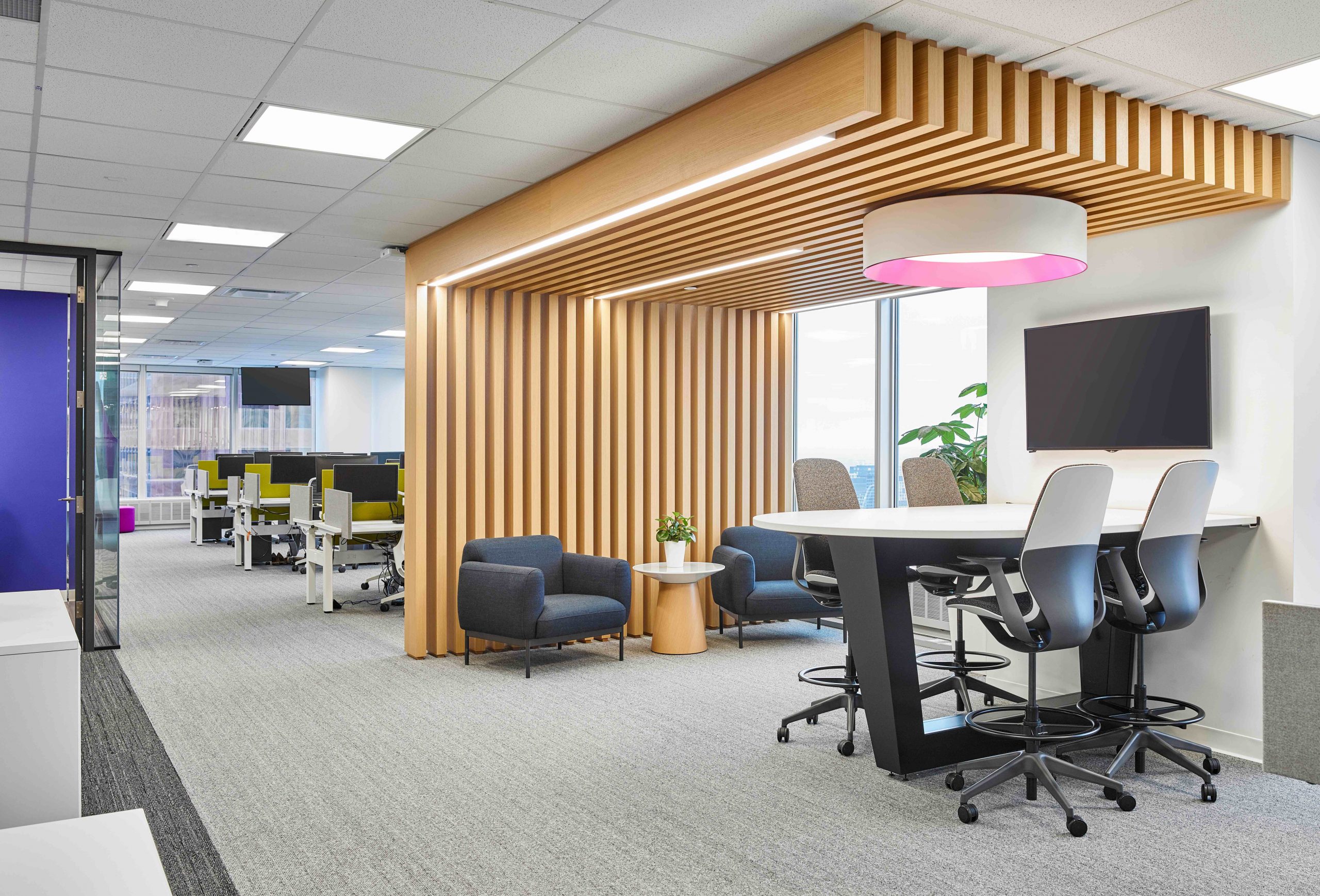
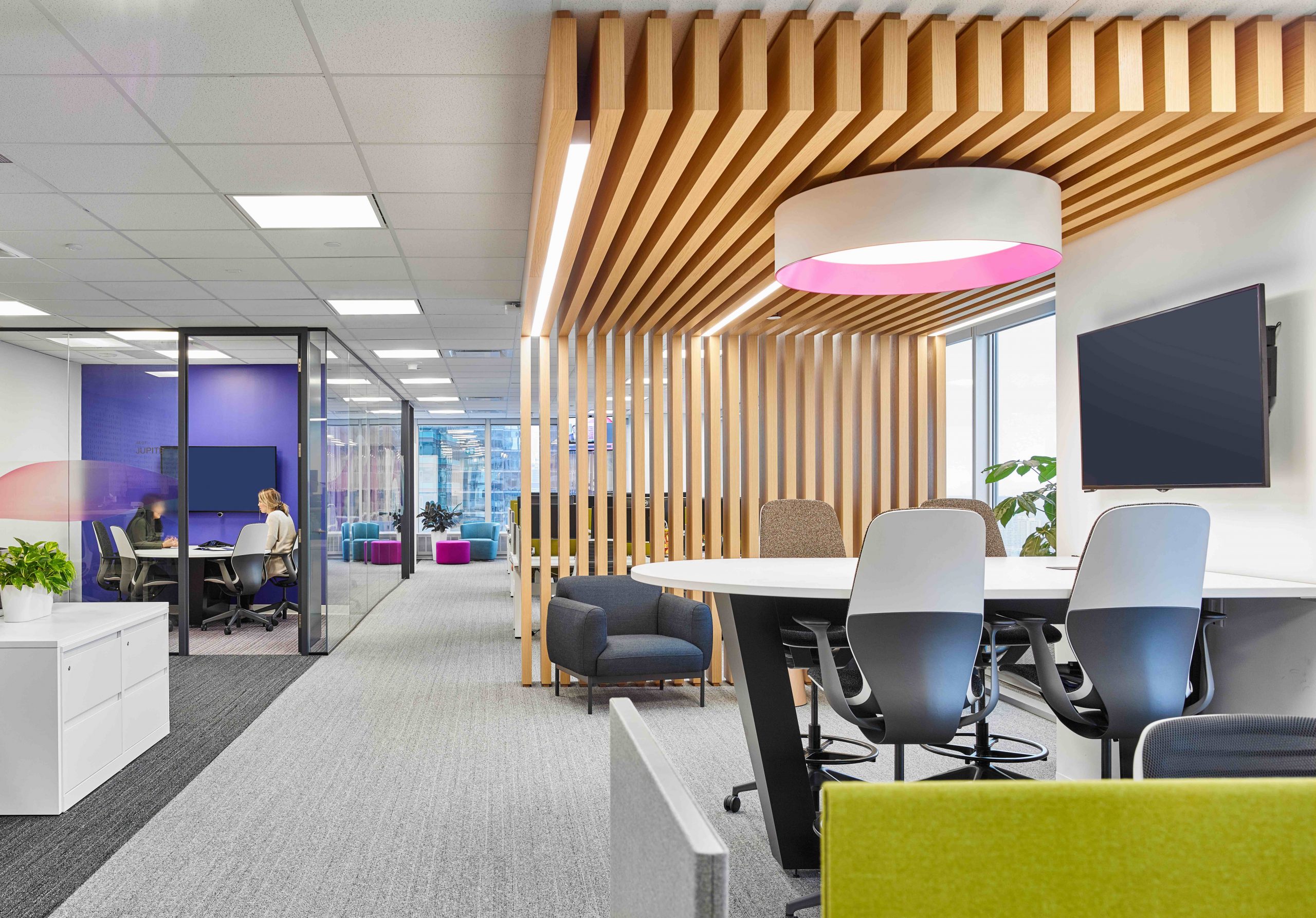
The client’s direction was to leverage off the global brand direction based out of their Beijing, China office. SGH adapted the gradient palette of bright purples, pinks and fuchsias within a Canadian sensibility introducing the warmth of wood detailing and luxury vinyl wood look flooring to soften and delineate space. The use of colour and texture creates both linear and horizontal volume as well as break up areas by function including collaboration and community spaces. Light fixtures with a hint of pink, walls accented with purple and furniture upholstered in cool blues and fuchsia.
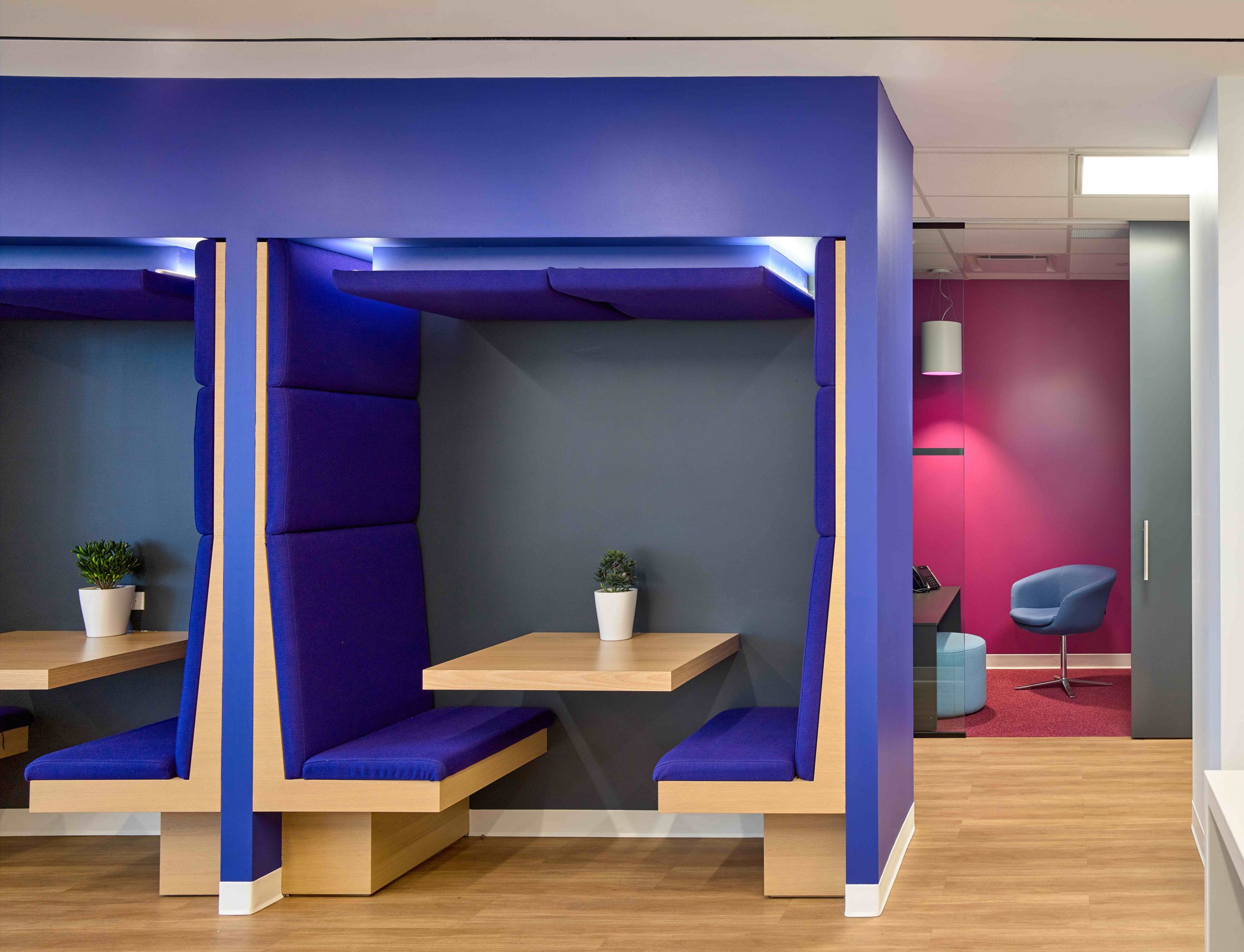
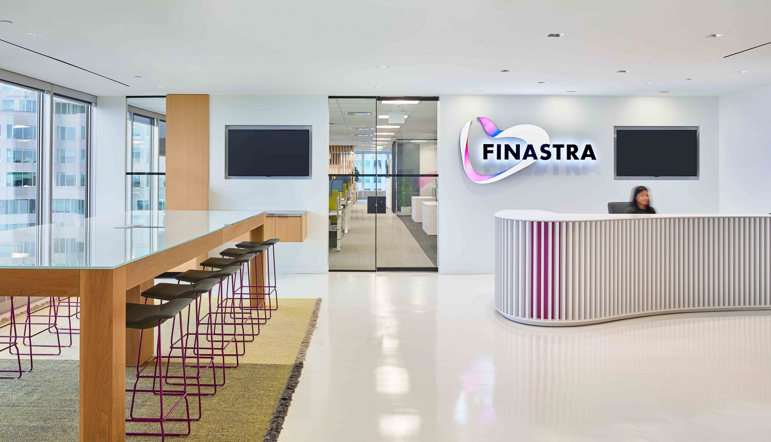
The design of the reception desks was inspired by the clients curvilinear, ribbon like corporate logo. The concept of movement or digital like waves is found in the undulating reception desk with a hint of pink and in the luminous film used on glass fronts which also provides privacy. Wave-like patterns and textures reduce, expand and calm in areas where people come together. Colour is used to add playfulness but also serves as a directional guide that builds pathways to where collaboration areas are located. The open site lines and colour allows end users to quickly navigate through the space.
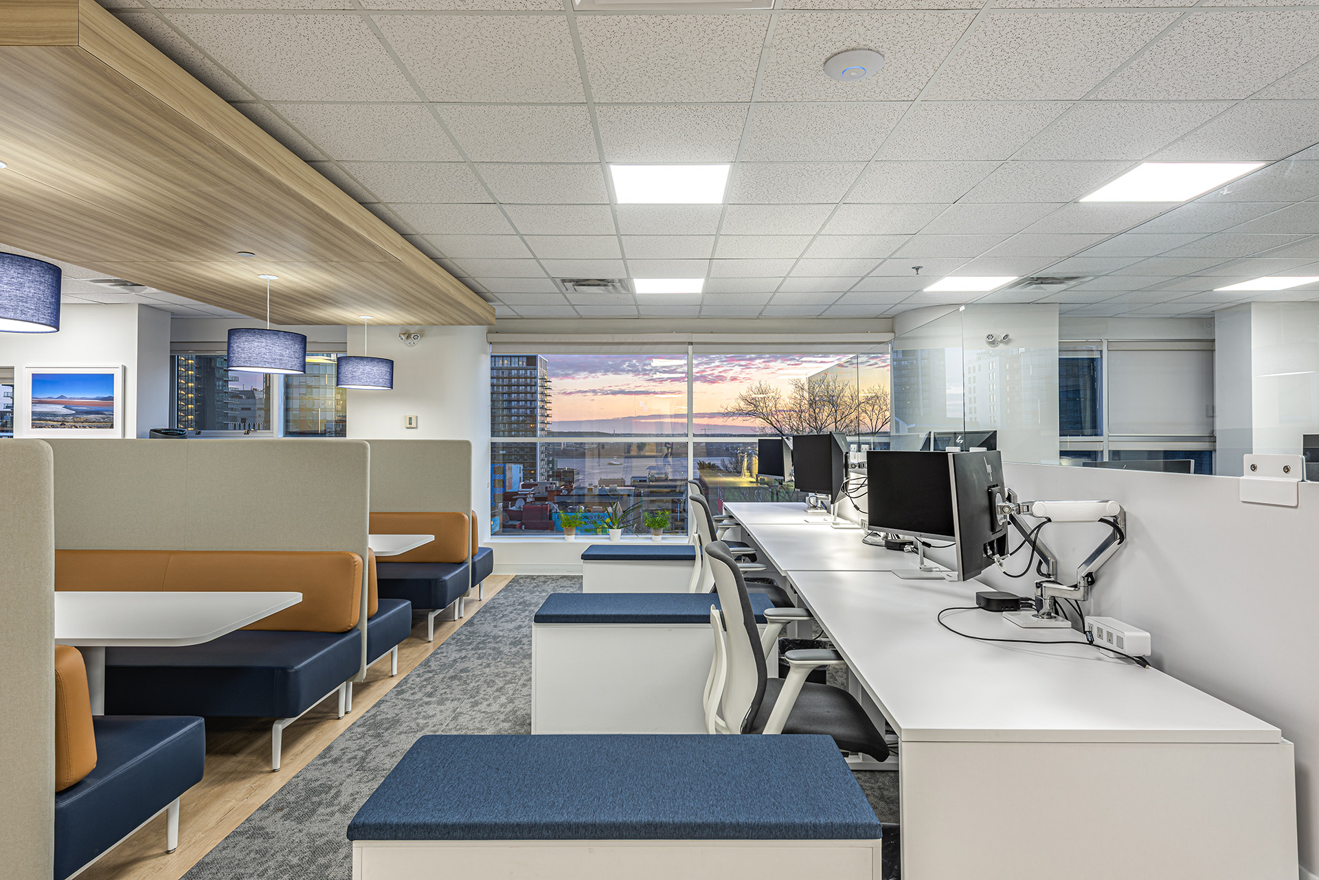
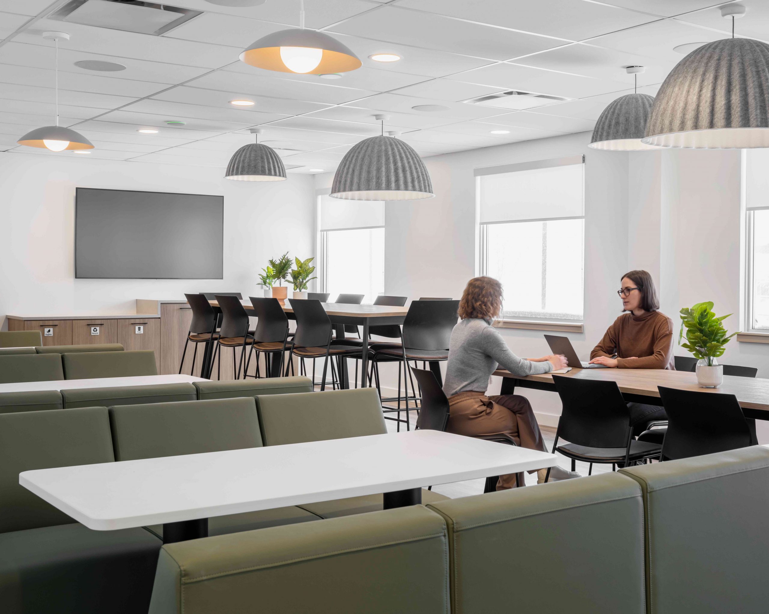
The general approach to the architecture is clean, timeless, neutral and open with glass enclosed collaboration rooms, accessible community areas wrapped with slatted wood feature details, and continuous site lines that allow visibility into all areas of the office space. Shared spaces are located on window space with plenty of wall space designated for collaborating and sharing ideas.The colour infuses energy, fun as well as communicates purpose. Purple defines more enclosed meeting area, deep pink a quiet focus zone and the warm honey rift cut maple is found in more formal, front facing areas. The overall feel is professional, open, bright, and modern with colour used to both enhance and communicate intent.
Client Statement
Our new downtown office at 199 Bay is a much more compact and efficient space than our previous office. We completely eliminated private offices and implemented an open floor concept. As a result, we are seeing so much more teamwork and collaboration at both workstation, multiuse collaboration areas. Specifically, the lunchroom is now a bright and open hub for all to enjoy, it is highly used. There is truly a great and comfortable flow when you walk through the office.