Story Time, Behind the Scenes Designing for this Financial Client
This renovation in place for this existing downtown Nanaimo location, swiftly transitioned into a tedious relocation project. After establishing all design criteria for the renovation in place and starting the process of working through permit items an unexpected base building restriction resulted in the decision to shift gears and relocate.
After extensive evaluation with the Client considering various locations it was determined this Financial Client would move to a rural/suburban environment in the Nanaimo North Town Center Mall. This existing shopping mall is in the process of “de-malling” to revitalize and bring together both commercial and retail space in a hybrid environment. This client selected two of the new commercial retail units (CRU) being constructed in a setting surrounded by water, forest and beautiful natural landscapes. The sacrifice, a less accessible space to the variety of social amenities offered by their existing downtown location.
The space needed to accommodate two very different user groups. The first being a louder and more energized call centre, the second a quieter, heads down, focused finance and accounting group. Both needed lots of collaborative space with a variety of closed and open options, easily accessible and flexible.
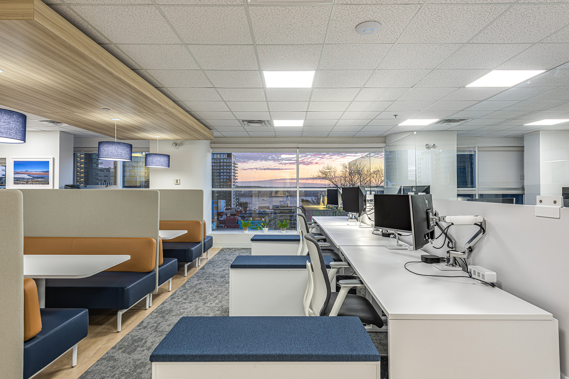
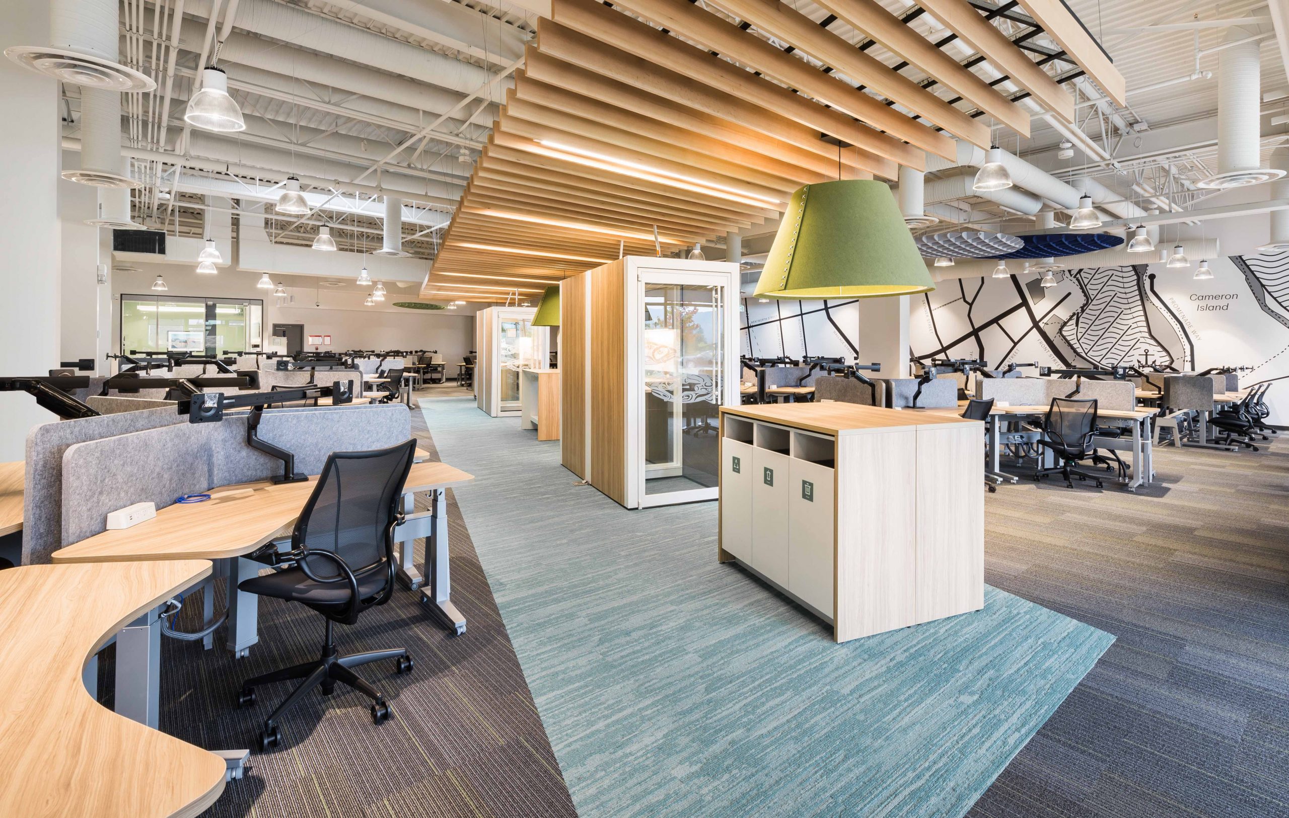
The two user groups are buffered from each other through the creation of “collaboration avenues” which are defined by a change in flooring and a dropped wood slat ceiling feature to create refuge and visual breaks in between the open spaces. Fresh accent colours of spring green and ocean blues infuse a calming atmosphere in this open, bright and modern space. Adding three new skylights and coordinating carefully with mechanical requirements bring in additional natural light and air that fills the whole space. Large walls provide the introduction of art and graphics selected specifically to represent Nanaimo, BC.
The overall floor layout is free-flowing and organic with centralized collaboration avenues which house focus and meeting spaces. Amenities include phone booths, perch points, pause areas, training and coaching rooms set up for privacy, focus or spontaneous interactions depending on the need. These inviting spaces are open, engaging and transparent allowing light to filter through panes of glass. The curved and soft edges of the 140 workstations create an approachable friendliness that contrasts nicely against the rectangular rigid architecture allowing for a variety of ways to circulate through the space. This casual approach encourages people to interact and socialize through spontaneous happy encounters that aspire to make the workday a welcoming experience which, in the long run, helps to attract and retain great talent.
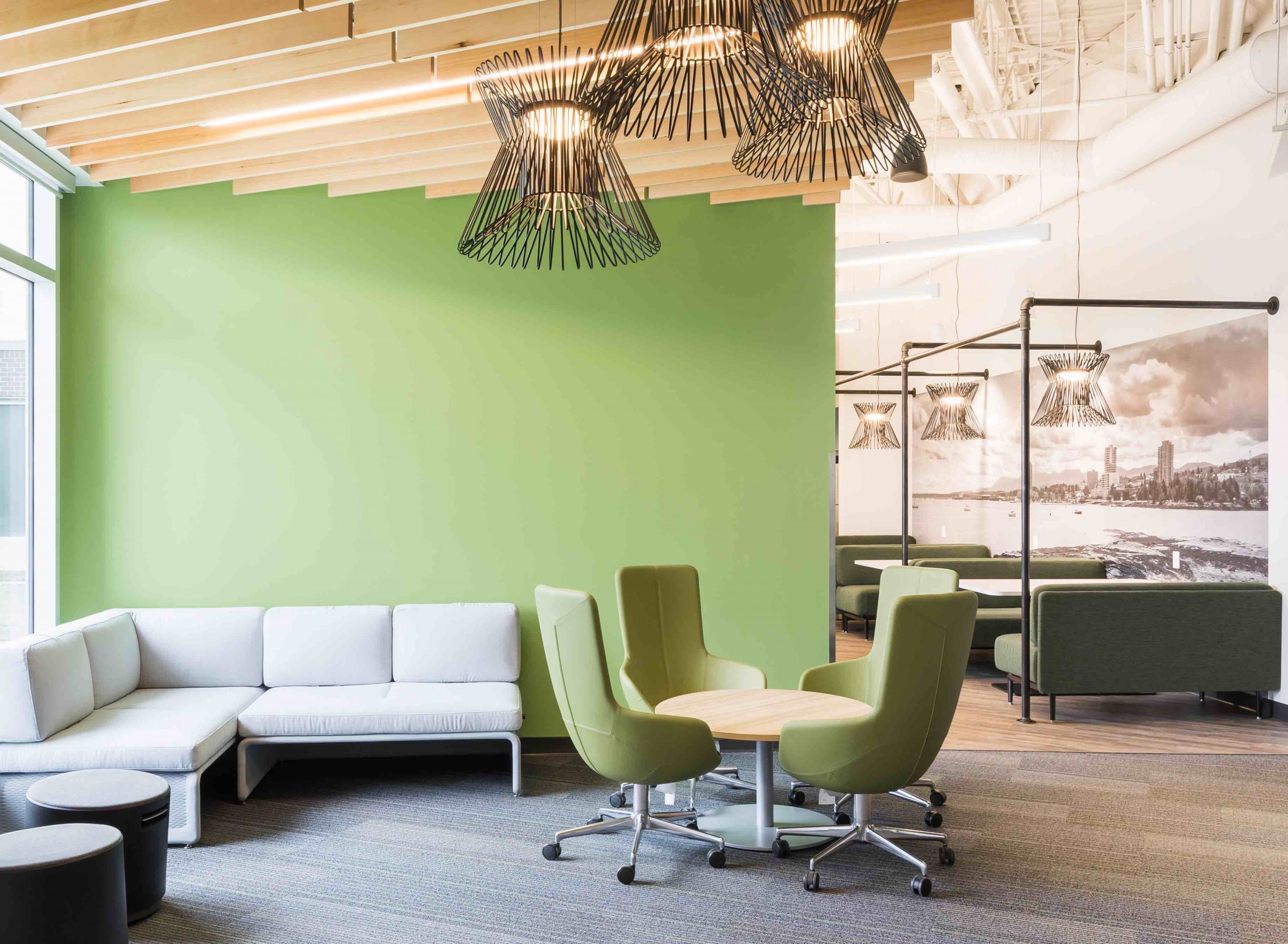
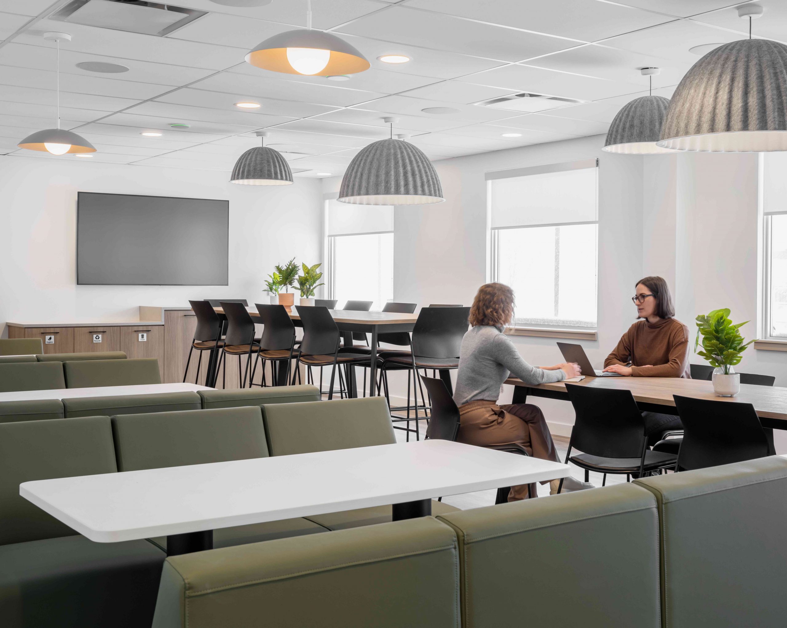
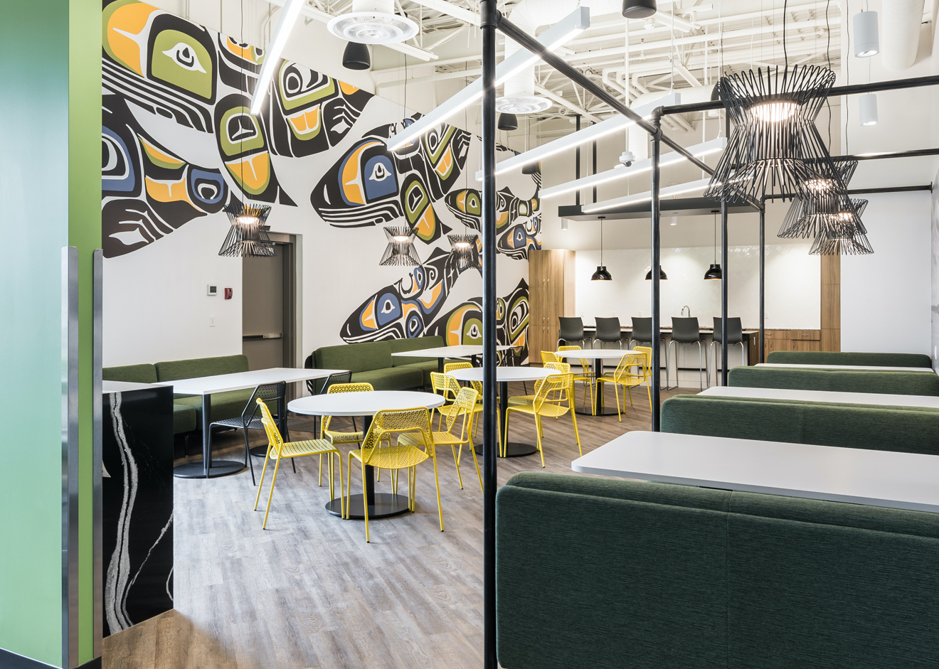
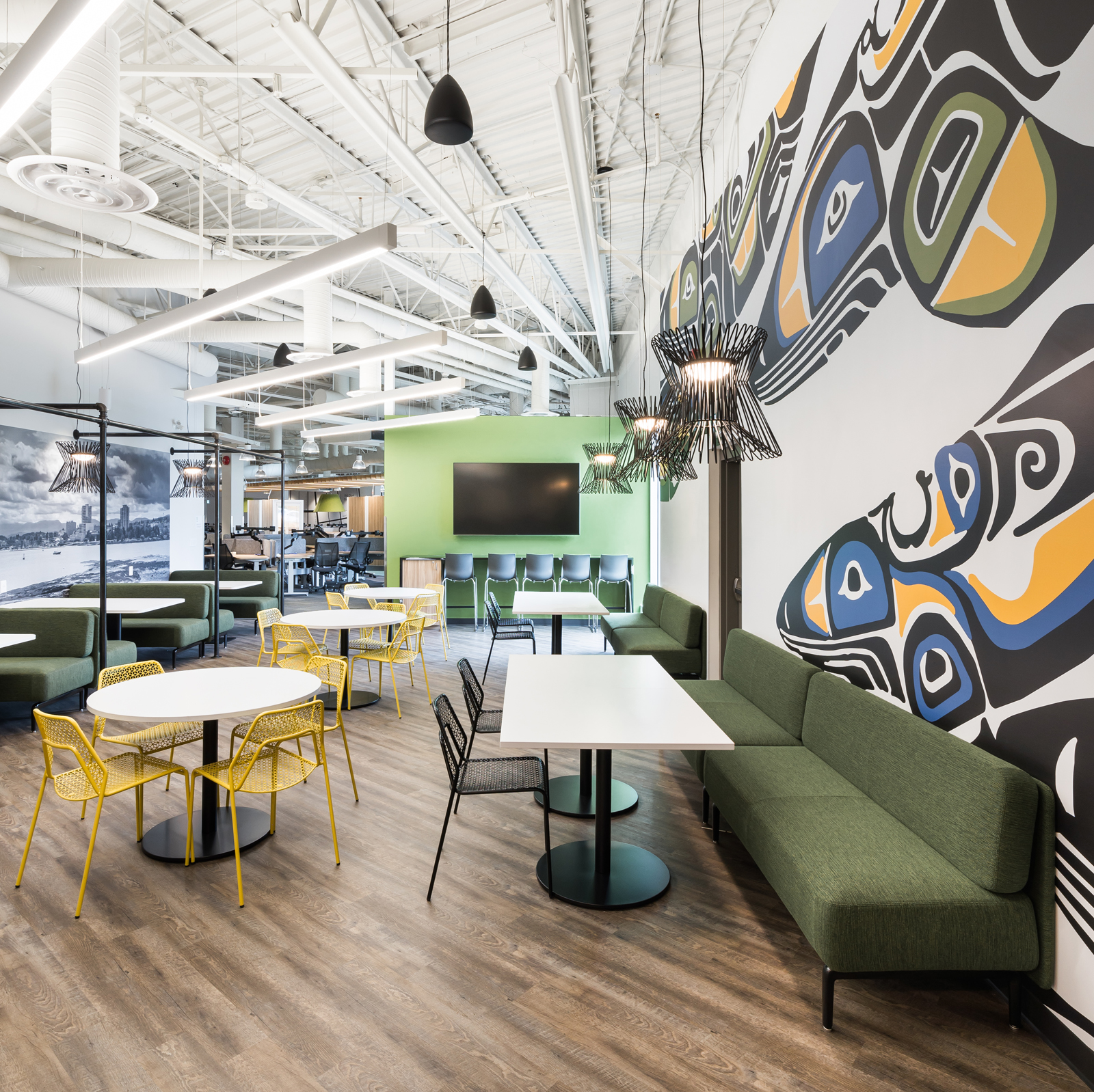
What made this space location really sing is the introduction of the employee café. It is a bright and inviting destination spot where people can gather, dine, meet and socialize. This makes up for the lack of access to eating areas close by and fosters a real community feeling. Beautiful artwork created by local artists celebrate this unique and rich indigenous community. Implementing graphics and common meeting areas such as the employee café were critical for this project’s success. Soft furniture settings and booth like seating provide a variety of uses that entice people to drop in throughout the day yet lightweight enough to allow flexibility in accommodating large town hall gatherings. Skylights were integrated to help with access to natural light, this kept the windows open and did not block light that was able to engulf the space throughout.
Through active listening the designer was able to really understand the workplace strategy, goals and significant changes required for this future office to be highly successful now and into the future. The proportion of flexible work areas to shared meeting and focused areas was clearly defined as part of the discovery process early on. In the end the open, expansive industrial space achieved this most successfully as was vetted out in the search for the right location.
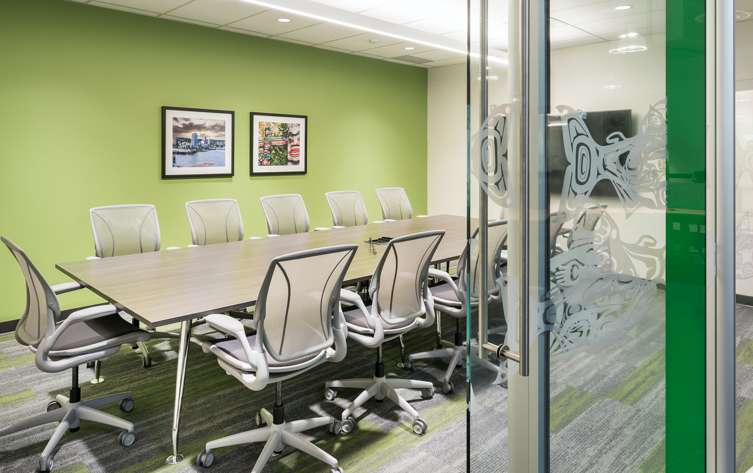
The open organic workspaces are agile, flexible and spacious. Flanked by focus rooms, meeting areas, and closed areas there is a break from loud space to quiet refuge space. The approach to colours and texture are soft, natural and timeless utilizing the clean modern lines of the building space. Furniture has rounded edges and breaks from the tradition grid pattern that allow the space to have a spontaneous energy. High, large walls proudly display local artwork that define spaces, provides orientation and infuse local humour and culture.
Client Statement
The new offices were a huge success and well received by our staff. SGH Design Partner approach to programming, data-gathering and workplace strategies allowed the SGH team to understand our goals and objectives for both short and long term.
SGH did an excellent job at integrating our standards for workplace while utilizing their creative skills to integrate a workplace that reflected the local Nanaimo culture, look and feel. The results were realized immediately. Design elements such as access to natural light for all staff, open and generous circulation space, multiple collaboration spaces, etc., have all contributed to the new design of our work environment to help improve staff morale and staff retention.
